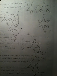
Well, sitting here in bed all weekend nursing a cold but with laptop by my side, it would appear that I finally have time to upload photos and a bit of commentary on Chapter 4. Guess there's a reason for everything...
Saving the world, one stitch at a time.
"We all move on the fringes of eternity and are sometimes granted vistas through the fabric of illusion." -Ansel Adams
05 December 2009
Chapter 4 - Cut and Fold Design Sheets in Black and Coloured Papers
Well, sitting here in bed all weekend nursing a cold but with laptop by my side, it would appear that I finally have time to upload photos and a bit of commentary on Chapter 4. Guess there's a reason for everything...
29 October 2009
Chapter 3 - Design Sheets A, B, & C
The counter-change [A-i] was fun and interesting to do and satisfied my value of being precise with cutting ;-) First, I found a ninja star shape and added a small 6-pointed star in the center for interest. Next, one of the shapes of the star trek badges. The picture I found had a light shining from behind, which made it look like a 5-pointed star. I wonder if that's how the designers came up with the original design back in the 60s. I'm sure the more recent badges were based on a distortion of a star because the small inner star has simply been stretched upwards.
I'd wanted to do something with the 8-pointed star, so I chose that for the interchange sample [A-ii]. I like the contrasting shades and was surprised at the new inner shape - a cross!
For the a/symmetry and distortion sample [A-iii, A-iv, and A-v], I chose another 8-pointed star. I have a very simple computer program (ImageTricks for Mac) that will do various things to an image. I played around with it and compiled some samples (see earlier blog entry). I used that to stretch the star into different distorted shapes and then cut them out.
The distortion into diamond, circle, triangle, and square [A-vi] was more thought-provoking because I wasn't able to do this on the computer... I had to imagine how the star would distort within the shape. I used a compass to round out the points within the circle and the diamond (not sure that's accurate, but...) and stretched the star into the triangle - sort of opposite the widened star trek symbol. I wasn't really happy with squaring off the points of the star in the square - it just looks like it's been enlarged. How else could I have done that?
I had wanted to do something with the 8-pointed star in Design Sheet A, so it appears here in the "sub-divided and counter-change" [C-i].
I then took two different sections to work with (new motifs A and B), as well as a leftover shape (new motif C).
With new motif C I tried many different patterns and arrangements but liked these most. They are quite simple, and they remind me of some Native American art, C-C4 and C-C5 in particular.
If I do this again (if I had done it differently), I would use larger pieces, differently-colored paper, and something other than newsprint for the background.
Still, I am relatively pleased with parts of the outcome (C-A2, C-B3, C-C4). I did not mix the three new motifs. I tried a few combinations, but they didn't produce patterns I like. They looked more like pieces that had just been thrown down haphazardly, and although that would be one option, it doesn't fit my need for tidiness ;-)
01 October 2009
Kaleidoscope
A couple of examples...
 |  |
| image 2.10 | image 2.11 |

27 September 2009
Star Shapes from Coloured Papers
 |
| image 2.7 |
Now that I stand back and look at the page I've just completed [image 2.7], I see that I haven't developed much at all from the foundation Module. I'm still pretty much stuck in the explicitness of representations, not interpretations of them. I had fun using a craft knife to cut tiny details in the stars, but it's just reproducing what you can print out from the computer. Nothing fancy, interesting, or original there. With the extra space I had left, I started tearing paper. Also played a bit more with scissors (I don't have pinking scissors) to give the stars rough or frazzled edges (kind of like the fringe on leather bags in the 60s). The big "comet" toward the bottom-right was done with a cutting wheel. Instead of the "correctly" folded paper for the first set of snowflakes, I mis-folded some paper and cut the shape to see what would come out. Sort of hard to tell where one flake ends and the next begins.
It will be interesting to see how distorted shapes will look in Chapter 3.
We went for a walk to the store and I saw this bush with these tiny star-shaped flowers, emphasis on tiny! [images 2.8 & 2.9]
 |  |
| image 2.8 | image 2.9 |
Another star:
21 September 2009
Star Stamping [Chapter 2]
 |
| image 2.1 |
Painted papers yesterday. Have chosen blue and orange, turquoise and reddy-orange as the colors I'll be working with.
I've been toying with the idea of using silhouettes of stars such as Bette Davis, classic icon Marilyn Monroe (a la Andy Warhol). Yesterday I spent some time trying to carve out a silhouette of Michael Jackson [image 2.1]. I thought it turned out pretty good, but when I asked Mayumi who it was, she said "You, sitting down?" (Never ask for comments on your art ;-) Sigh. Oh, well. I played with that stamp a little, just for fun. You can see it above in yellow...
But seriously, folks, today I carved out one "finger" of the star that I found on the box of dates [image 2.2] and then found different ways to use it on some of the papers I painted yesterday [images 2.3~2.6].
 |
| image 2.2 |
 |  |  |  |
| image 2.3 | image 2.4 | image 2.5 | image 2.6 |
The most fun/interesting was using just one end of the stamp (the pointy end) and developing patterns with that. I managed to make small stars with it, as well as a kind of pattern that looked a little like scales on a fish. Which reminds me. Dinner time. More tomorrow!
18 September 2009
Color Wheels in Your Eyes? [Chapter 1]
 |
| image 1.4 |
A few days ago I started on the line drawings and rubbings (not enough of these - still looking for objects) [image 1.4]. The rubbings are of jewelry. I thought it would be relatively easy to find stars at places like temples or cemeteries here in Japan, but so far, I haven't been able to find any. Will continue my search.
 |
| image 1.5 |
Am now on my 3rd attempt at the color wheel. The first one did not have enough distinction between the reddish-orange and orange. The second one not enough between the red and reddish-orange, and I made a mistake with one of the yellows. Here's the 3rd attempt [image 1.5], but again, there isn't enough distinction between the red and reddish-orange. Will do this a 4th time to see if I can approach more closely the colors I want.
Working on this color wheel every morning from 4:45 puts me in a frame of mind in which the rest of my day is colored. The rice field out back is no longer rice, but a particular tint of a yellowish-green with shades of darker green. The logo at the gas station across the street isn't just red any more. I'm aware of the slight oranginess of it. Colors have become more vibrant - on the subway, in my office, walking along the street.
Fascinating!
16 September 2009
A Star is Born!
Well, that's one kind of star, I think. ;-)
So here we go with Certificate Module 1 - *Stars in Your Eyes*
To begin with, I've chosen to work with stars in this module for the simple reason that I have always had stars in my life. As a kid born on the 5th of July (right after Independence Day) I was very patriotic and loved anything with patterns of stars and stripes.
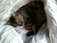
In junior high school I started watching old movies and studied a lot about Hollywood stars. I also started signing my name with an asterisk and a period/full stop (few people have ever asked me why...). In high school I started acting and wanted to become a "star". And, living in N.E. Los Angeles, would often drive with my friends from h.s. through Hollywood and Beverly Hills after school, looking for movie stars. For years I've been drawn to military insignia (though am a pacifist at heart). I loved staring at star patterns in the old Jewish temple in Cordoba and at La Alhambra in Spain. Like most humans and a cat I used to know, I love the night sky, gazing at constellations and the Milky Way. My 2nd favorite song is "When You Wish Upon a Star", so I used that for the cover of my journal for this course (img 1.1).
 |
| image 1.1 |
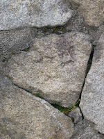
I've been looking for star shapes in particular the past few days. Just as in the Foundation Module (through which my appreciation of walls was permanently changed), it's amazing how stars pop out at you in the most unlikely places if you are vigilant. Here are a few that I've photographed (click on the images to enlarge):
 |  |
| image 1.2 | image 1.3 |
23 August 2009
Foundation Module - Resolved Sample 2
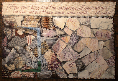
When I thought about what to do for Resolved Sample 2, I wanted to do something that I might be able to frame. Just looking at a wall didn't seem too appealing. I thought of the quote by Joseph Campbell and that's where I got the idea for the door.
What I was trying to do was to create a wall with a door in it that leads to a colourful world beyond. Sian mentioned using perspective so I thought that a door would require a certain amount of perspective if it were open. Obviously, my piece didn't work out as expected. I think I would have to alter the perspectives of the stitches as well. I did manage to keep the patterns relative to where they would be if it were a door ajar.
I realized quite a while back after I had already started on this final project that I was copying reality too much. When I talked with Syl & Cynde, I began to understand that we were probably to use the idea of a wall - it's patterns, textures, shapes, and colors - to interpret, not to replicate. Oh. Ok.
Nevertheless, I am glad that I did aim for similitude because it gave me a chance to make an attempt at using what my eye was seeing to match colors and patterns as much as I could. That was fun and interesting.
The other thing I did was to mix rubbed and dyed paper shapes with the stitching. I had wanted the picture to flow from a 2-D visual wall to a 3-D texture with some loose pieces in between so as to not have a clear beginning and ending for the two sections. I like the way it came out, sort of, but it's was too heavy on the left/stitched side and much lighter on the paper side. Standing back, I should have left more space between the rocks in the stitched section. I think that might have allowed the door to come out better. As it is, the door gets lost within all the stitched rocks. It is not very well defined.
Looking at it now makes me wonder how a B4-sized canvas could possibly take so many months to complete, but I have learned so much on this course:
* There are more stitches than the up-down-up-down that I did in high school.
* You can make colors even when you don't have the one you want in the crayon box (thread box).
* Wax and paint don't mix, and that's good sometimes.
* You cannot hit Command-Z to undo stitches. You have to take them out one at a time.
* It's a good idea to keep a Band-Aid handy
* Even when you really want to work on a project, life sometimes gets in the way.
* I will never look at walls in the same way I used to.
And I'm sure there are many, many more things but my eyes are closing and I have yet to finish packing. Off to Umpqua for 2 weeks - hopefully with some time to play with Cynde and Sylvia and Georgia!!!
---------------
p.s. Sept 21, 2009
Have just finished putting the resolved sample 2 onto a frame. Will be giving it to a friend.

26 May 2009
Resolved Sample 1 Finally Resolved!

and here's the original:
I attempted to match the colors in the rocks (except for the white thing at the right) as accurately as possible. Given that I didn't have the right colors, I used some of the thread-mixing techniques from earlier steps in the course, for example mixing two colors in the needle, using one color underneath and a different one on top, etc.
How I could have done it differently:
I could have used other stitches. I also thought about how I could have added even more of the points that came out in the rubbing, or at least used different colors/threads to bring out more the ones I did include. Some of the points I included were washed out because I didn't use colors or threads that were distinct enough from the background. However, I was pleased at how the rock in the center turned out. I used white, grey, and a kind of beige-brown yarns as the base color for the rice stitch, and a variegated beige for the top stitches for the rice stitches, and think that the changes in color in the rock were fairly well represented in this section.
The white section at the top right was one I had begun (and threw out) for the "Stitchery from Rubbing" step earlier. I went over it with the lighter colored variegated yarn, but just enough to give it some color and texture. Just to the left is a section in which I used beige thread and pulled the stitches together, creating an open space of dark (on the black background). I kept thinking that it's okay to fill in every single space on the canvas, but isn't it equally important where there isn't anything? I'd like to experiment more with that at some point.
The grey section of Zs (Ns?) at the top was just taking a theme I (imagined I) saw - a squiggle - and using that impression, filled in that rock that way.
Things I learned during this section of the course are:
1) Smaller stitches take a lot longer than big ones.
2) The project itself takes a lot longer than what you think it will when you start out.
3) There is no Command-Z key in this kind of work. If you make a mistake or want to correct something, you have to do it by hand, undoing one stitch at a time (or snipping carefully with scissors ;-)
4) It's fun.
5) It's really fun to look at it once you're finished and can uncross your eyes.
The most difficult part of this has been letting go of "there's a right way to do this." I'm accustomed to writing research papers, not using my hands to develop creativity, which is precisely the reason why I signed up for this. So, it's an ongoing process of discovery.
One more Resolved Sample to go!
16 May 2009
Dyed-paper wall
I chose a new section of the wall, and started matching the colors and patterns to the rocks in the wall.
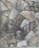
Then, carefully tearing the papers, I tried to match the shapes in the wall, weaving the papers under and over each other and then gluing them down.
The end result is:

The process was relatively easy, and it helped me to think about not only the shapes in the wall, but also the colors, textures and patterns. I'm assuming that this process will clarify my thinking when I plan for the final projects.
When "Life" gets in the way...
Well, it's been over a month now since my last entry. Something called "Life" has been getting in the way, you know, things like marking homework, planting in spring, company visiting. Anyway, here's an update on my "homework" for this course.
Based on the rubbing I did back in the 19th century (or so it seems now), I began one canvas, got an area of about 15x5cms finished but didn't like it at all... so I started over. The second try seems better.


I've begun to fill in the background, and this will be based on the surface texture of the rocks and on the spaces between the rocks. I'm thinking that using regular sewing thread for the darkest parts will let the black color of the "canvas" show through. I'm also taking Sian's advice and "pulling" threads together/apart with the stitches. That's interesting. It also seems to happen naturally with the strange canvas I'm using.
But since there is little time until the deadline for the end of the course, I decided to forego filling in the background for the moment, and move on to the next part of the course, color stitchery.
The canvas got in the way with the broad cross stitch sample (upper canvas). The stitches weren't straight, plus it started eating away at the threads in the yarn. I get the idea, and if I did it again would probably be able to get a better result. Will include this on the final sample.
However, color stitchery has been terrifically interesting! Blending various threads of color to effect a variety of hues. I knew it could be done with paints and watercolor, but hadn't thought of it in threadwork. It has been fascinating playing with a simple rice stitch, changing the colors of yarn/threads on the bottom and top, reversing them, using variegated yarns, a variety of colors. I don't yet feel as though I've adequately reflected the exact colors that are in my wall, but some of the rows of stitching are fairly similar when viewed from a distance. (This reminds me of some of Dali's work - in particular, his work of Lincoln which was composed of hundreds of smaller images, each in a prominent color to make up "pixels" of Lincoln's face.)
When I take a look at the wall by making the jpg larger (by 4 zillion times or so), I can see each pixel. There really are some shades of purple, and I wanted to find some kind of dusty purple yarn, but they didn't have any at the store, so this method is perfect for this situation. If I only need hints of color here and there, placing the purple underneath and a grey above, it gives a bit of the purple without drawing attention to it.
Now I wonder what other kinds of stitches would lend themselves to this kind of interweaving of colors. Also, what would the effect be of stitching colors over areas of stitching where only one color had been used. (The 15x5 area I did and didn't like is in solid white. What would happen if I added some tiny bits of color over the white? Will experiment with that later.)
I've dyed sheets of paper for the next step, textured papers, and will be finishing that step today.
More soon!
29 March 2009
Step 5 - stitch variety
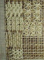
The books have arrived!!! I'm now trying a variety of stitches in the same color.
In this picture, the first column (top to bottom) are tie stitch, rice stitch, florentine stitch, long armed cross stitch (is there a one-armed bandit stitch?), second column: smyrna stitch, and Italian cross stitch. I can see that the different stitches produce different effects... to my (untrained) eye, the tie stitch looks like a careful, fixed, background, maybe if there's a rather orderly surface of something, this might look okay. The rice stitch seems to give a feeling of a rough texture, the florentine stitch (on a normal canvas?) would be good for a smooth surface or background, the long armed cross stitch has a slightly rougher appearance, but has a certain flow to it. The smyrna stitch looks like a plant (or fireworks) or at least gives a light feeling, and the Italian stitch seems to me to be somewhere in between the rice stitch and the smyrna - the rice stitch seems thick, the smyrna thin. (Not sure any of this is right. Just my initial impressions.)
I can see how the variety of these stitches add texture - knobbly or smooth, bristly or flat - to a representation of a wall. However, some "threads" don't lend themselves to being used as such. Note to self: stay away from the fluffy, mischievous kind of yarn.
27 March 2009
Steps 5 & 6 (2nd attempt)
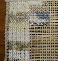
Ok, here we go again with a different stitch, and this time, using a stronger material to stitch on, kind of like burlap, but stiffer.
This time, it was much easier to work with the yarns and threads, but that impudent fluffy yarn crept back into the room (top of the second column)... once again, impossible to get through the "canvas". It even broke some of the threads. Out you go!
As I was stitching and having an evening snack with the family, I took a shiny candy wrapper, cut it into long thin strips, and experimented with sewing that as well.
18 March 2009
Steps 5 & 6 (1st attempt)
.jpg)
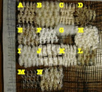
A: cotton kona fine (that's what the label says)
B: "Love Bonny" yarn
C: embroidery thread
D: an old rubber band (but it broke); a stalk of weed growing in the rice field behind my house
E: variegated jute
F: cotton kona in a different shade
G: some VERY unruly yarn. It looked and felt so soft when I bought it, but it was simply so uncontrollable that I sent it out of the room!
H: some kind of yarn that looks like a cross between porridge and a sheep (I'll have to remember this one if I ever create something commemorating Wallace & Gromit's "A Close Shave"). On the label it says "bu-kure" - it this the boucle cotton listed in Sian's sample in the instructions on p. 6?
I: silk wool lame with sparkly silver threads running through
J: satin ribbon
K: embroidery thread (different shade, still practicing the stitch)
L: variegated mohair yarn
M: sewing thread
N: (jute, practice)
The most difficult part was trying to control the stitches when the canvas threads kept moving around. Hmmm, there must be a better way...
12 March 2009
Steps 3 & 4

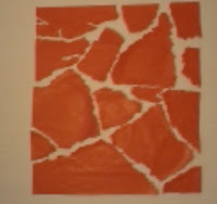
I created a shape observation page. using red tissue paper on a white sheet of drawing paper. (image is reversed here)
02 March 2009
Step 2 - a rubbing
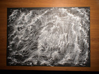
Would like to go back and do another rubbing using white paper and a black pastel...
01 March 2009
Step 1: Finding materials and a wall
Now on to Step 2.


