26 February 2010

Chapter 9: Reverse applique - traditional and contemporary methods

First, made a paper sample so I could see what it should look like when it's finished:


9.1 Paper sample design

Then followed the instructions to make the first sample in fabric. Cotton fabrics in blue (bkgrd), rust, peach, and printed red top layer. Fairly easy to do. Have to keep enough material to turn under. Hardest part is the tips of each star because there's nothing to turn under at those points (pun?).
9.2 Finished sample traditional method

The next step... Chose a slightly different 8-pt star shape and made two sets of 5 cotton layers of a base of stamped red, then blue, rust, peach, and a top layer of stamped dark blue. Both samples have the same pattern and colours in the same order. In sample 9.3 I sewed and cut from the outside inwards. In sample 9.4 I sewed and cut from the inside outwards, and frayed the edges of the shape. In 9.4 I also left a kind of frame starting with the top layer, and I am pleased with the result. Everything on both samples was machine-stitched in orange metallic or dark blue metallic threads which, I think, gives the pieces a little more lustre. I was quite surprised at the differences between the two samples, even though they started out exactly the same. So, subtle changes in method can produce great variety in the final product in terms of texture. This was fascinating. Sample 9.3 is a much more orderly, clean version, and 9.4 is more active and has a fluid feeling to it.
9.3 Outside shape stitched first
9.4 Shape sewn and cut from inside outwards

Both of these samples are simple when backlit (9.5 and 9.6). The red shows up nicely in the to sizes of the 8-pt star, as do the needle holes:


9.5 Sample 9.3 with backlighting

9.6  Sample 9.4 with backlighting

The fourth (9.7) sample uses 3 layers, red, peachy-orange, and a stamped bark blue top layer. I used the same shape as sample 9.2 above, machine stitched double rows in concentric shapes, cut between the shapes and frayed the edges between. Once again, painted areas were more difficult to fray. If I were to do this again, I would make the space between each shape wider so that the colours in lower layers would show through. If I did that, I would also use 4 layers.

9.7 Slashed reverse applique

The fifth sample (9.8) uses various piece of fabric and one complex shape. I found it difficult to remember 1) where I had sewn and 2) where to cut the next layer. I made a mistake and cut one section that was the bottom layer. So, I realised that I should have put one complete layer as the background and should then remember which one it is so I don't cut it.


9.8 Multicoloured ripple effect (1st attempt)


I wasn't too happy with this attempt, so I made another sample (9.9) in the same shape. I think it turned out better. Perhaps the key is to 1) use plenty of layers (?) and 2) choose a shape that has several large spaces that can grow smaller with each consecutive sew-cut stage. Oh, and remember which 'layer' you have sewn last.


9.9 Multicoloured ripple effect (2nd attempt)


[Total hours Chapter 9:  16]


- * - * - * - * - * - * - * - * -

16 February 2010

Pendulum Art

Interesting way of painting - with pendulums.


http://www.ted.com/talks/tom_shannon_the_painter_and_the_pendulum.html


Chapter 8 - Complex Samples


[NOTE: During the earlier stage of making bonded fabric, I used the only fabric I was able to find that had one side with a glue that bonds with heat. The fabric itself is so stiff that it's difficult to work with. So, for some of the samples in this chapter, I made some new bonded fabric pieces in the color scheme I've chosen and using the fabric and threads I have on hand.]


Needed to read the instructions several time for this chapter and spend some thinking time to understand and plan. Looked at several other students' work to see how they did this and to get some inspiration.


Tried the first sample (8.1) with a turquoise background. Made a new bonded fabric with a sheer turquoise top layer (dark blue bottom). Tacked this in a simple star part pattern taken from the paper cutting stage. Machine stitched in metallic turquoise thread. Then tacked the outline of an 8-pt star star and machine stitched over the first layer in gold thread, cut a slit in the back and stuffed the cross in the center. I have to judge the amount of stuffing better... I think I used too much because it puckered.
8.1 Bottom bonded layer. Top "layer" machine stitched. 
Stuffed from behind.

For the second sample (8.2), a new bonded fabric in red, stitched and stuffed. I think I got the amount of stuffing right in this sample. Also hand stitched (straight stitches(?)) around the edges of the first layer. Doesn't show up so well, so could have used a stronger color for that stitching. Also could have put the stitches at right angles to the edges rather than parallel to the edges. I machine stitched the top "layer" in a 5-pt star shape. I'm not used to sewing with a machine (or at all for that matter ;-), so I will need a lot more practice to get this right.

8.2 Bottom bonded layer, outlined in hand stitches. 
Top "layer" machine stitched. Stuffed from behind.

For the third sample (8.3), I used  a background blue fabric that was not a solid blue fabric but had subtle variations in the depth of the blue, but it was not one that I had stamped or dyed myself (confession number 1). I used two bonded layers and cut out the center of the second layer, revealing the red from the first layer. I'd wanted to include some kind of snowflake pattern, and decided to stitch with metallic turquoise thread using machine zigzag stitches. I like the way this turned out, but I think I should have gone a little further with the snowflake pattern, maybe sewing all the way to the ends of each red point and then half-way to the end of each of the blue points. Then the snowflake would really look like a snowflake, or at least stand out a bit better.

8.3 Two bonded layers with top layer machine stitched

For the fourth sample (8.4), I went back to the white bonding fabric piece I'd made in the earlier step. It had dark blue ninja stars in a design taken from the folded-paper cutting step, various bits of metallic threads and fabric, covered with a blue mesh. I used that as the background and then applied the first layer of the red bonded fabric in another folded-paper cut shape from the 6-pt star. I machine stitched around the edges in orange. In the center, I hand-stitched a ninja star in dark blue. When this piece is lit from the back, it reveals the ninja stars from the background bonded fabric (8.5). I'm not too happy with this sample because the overall effect of 8.4 isn't all that interesting to me. 8.5 is, well, just ok because you can see the same pattern of the top-stitched ninja hiding behind the red layer, but somehow it's not all that exciting. I like the pinholes from the machine stitching, though ;-) Maybe using something other than orange for the edge stitches and thickening the blue ninja in the center might have made it stand out more... Hmmm....


8.4 Two bonded layers and hand-stitched top ninja star

8.5 Above sample with backlighting

On to the next, fifth sample (8.6). One of the illustrations in the course guide (p. 31, bottom left) shows corners pulled back revealing an underlying layer in the center. Cool. So, I tried something similar. I took a stamp-printed fabric, outlined the pattern with machine stitching in gold thread. Used that for the background. I also took a piece of that and turned it back to front and placed that behind the first layer, the bonded red fabric.

That was sewn in metallic red thread on the machine. After cutting the outside, I cut from the center a hexagon (also stitched on the machine). I carefully cut away the inside red fabric, revealing the back of the extra stamp-printed blue piece. I then cut that into 8 slits, like slices of pie. I folded each "slice" back and tacked it with a gold stitch. This revealed the bottom layer of the stamped blue fabric base. I then stuffed the center from behind. 

Because there is a lot going on - gold stamping, shiny sheer red fabric, gold and metallic red threads - I think it's enough the way it is, but wonder if it needs more hand stitching. I think that might overdo it...

8.6 Stamped fabric background, bonded layer with same 
stamped fabric behind, stuffed from behind


Sample 6 (8.7) uses more paper-cut shapes based on a 6-point star. Background: printed red. The first layer of bonded white (Chapter 6 - 6.2) and the second layer of a new bonded fabric of a turquoise bottom with a blue straw mesh top. At this point, the whole thing was too stiff and thick to stitch by hand. (Actually, it was so hard to get a needle through, I wasn't able to tack this and ended up machine-stitching it from the back. Confession number 2 ;-)  Added a top "layer" of a 6-pt cutout shape in machine zigzag stitch in orange. It was hard to see where the stitches were going, so I was sewing off the lines [which is about right for me - I never was able to color inside the lines...] Is there a clear foot you can buy so that you can see where your stitches are going? 


Well, the idea is there, but I'm not happy with this one either. The materials are 1) too busy (colors, patterns, etc.) and 2) too thick to work with.
8.7 Stamped background, two bonded layers and machine stitched top layer


[Total hours Chapter 8: 21]


- * - * - * - * - * - * - * - * -


10 February 2010

Chapter 7: Translating Layered Designs into Embroidery

This was a bit confusing at first, managing to figure out how the pieces should be laid on top one at a time after tacking at the back and then stitching from the top side. This is the first sample I produced (click on the pictures to enlarge):
7.1 Sample 1

As a first trial, I think I picked something that was too intricate. The shapes are based on the 6-point star. On a dark blue background, the first layer is an reddish orange that was stamp-printed with a blue paint. I used a dark blue metallic thread for the stitching, but I think I should have used a similar red because it tends to wash out the blue of the printing. The top fabric is a kind of turquoise shiny sheer fabric. I used an orangey metallic thread on that which I think works well, but the whole piece seems too heavy and dark.

On to sample 2...

I was on the subway last week and saw an ad for an art piece at the Toyota Museum of Art. The poster showed a 5-point star made of glass, 3-D, with slightly shifted 5-pt star shapes behind it:

7.1 Poster on subway

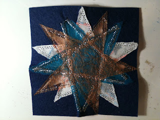
I was intrigued and decided to make something based on that. For a couple of years now I have been playing with light, experimenting with how shifting colors of light appear when shown from behind on Japanese washi paper. I wondered how it would turn out to combine that idea with these samples I was making in Chapter 7. Here's my first attempt at that:
7.3 Sample 2 (front light)

I didn't follow the course guide exactly here. Instead I used a piece of dark blue felt, cut what ended up being a 15-point star in the center, and then began using pieces on top of that. I guess this is more like the applique method later in Ch 9 (?). Anyway, the first layer was a new piece of bonded fabric of two pieces of sheer white linen with threads and tiny cutout stars between. I stitched it to the felt in the star shape I wanted, then cut it out. The next piece was the turquoise shiny sheer fabric, sewn on and cut in the same way, and the final layer was the gold glass fiber fabric. All of this piece was machine-sewn with silver metallic thread in straight and zigzag stitches. (By the way, this "glass fiber" fabric is 90% polyester, or so it said on the label when I looked last time I was at the shop. The material is imported from Italy. I looked on Internet for information on how to handle glass fiber material in terms of safety, but was not able to find anything.)

And here is the sample with white light shown from behind:

7.4 Sample 2 (illuminated from behind)

This final piece (Sample 2) has two dimensions - one when viewed with light from the front and another with light from behind. I think I'm on to something here.... :-)

But back to the basics... I read the instructions again which said to make several samples using the same shapes. So, I chose a 6-pt star and a ninja star. Nothing special, but a simple pattern to work with and to show the effects of using different materials.

7.5 Sample 3

In the third sample (7.5) I tried to choose a brighter color combination. An orangey-red background, shiny blue stamp-printed first layer sewn on with a simple orange thread cross stitch, and an orange ninja star in the center sewn on with metallic turquoise thread, machine stitched. In trying to fray the edges of the 6-pt star, I found that it was difficult to fray the portions that contained paint (a good thing to remember to prevent fraying!).

Also, I used orange thread on top of the blue fabric in a cross stitch patter - I think it adds just the right contrast and syncs well with the ninja star in orange.


7.6 Sample 4

The fourth sample (7.6) uses a turquoise background. The first layer is a negative of the 6-pt star in a printed gold glass fiber material. This layer is placed at an angle which, I think, makes the sample more interesting and highlights the blue background color. The top layer uses a bonded red fabric created from an earlier step, hand-stitched in straight stitches with a brighter shade of red. I think that, overall, this is a good sample, but again, the red ninja star seems too dark. Maybe a different shade of the mesh would bring out the underlying colors more. Hmmmm.

7.7 Sample 5

The fifth sample (7.7) uses a red background fabric printed in blue. The first layer is a white bonded fabric (the one that buckled in the earlier step) in the 6-pt star shape, and the top layer is a somewhat shiny dusty orange ninja straight stitched in orange metallic thread. I wonder if another shade/material would have been better on for the ninja star. In the end, it seems a bit washed out, even though there is a kind of sheen to the fabric.

The last sample (7.8 below) is the best so far, in my opinion. I wanted to go back to playing with cutout shapes and backlighting. I used a sheer dark blue shiny material (I have to learn the names of different kinds of material, don't I? !) on a muslin backing. I then used one of the bonded layers, machine stitched in metallic turquoise thread in short stitches so that none of the little pieces would fall out. On top of that, I used the plain gold glass fiber material, machine stitched in small, straight stitches in gold metallic thread, then cut it out, leaving the negative space. Actually, I made a mistake on this piece. With the other samples, when I drew the shapes on the back of the backing fabric, I used either two different colors or different thicknesses of pen. On this piece, I forgot, and drew both shapes with the same pen. Then, when I went to sew the tacking stitches, I sewed the outside shape from one pattern and the inside shape from the other. After I'd finished cutting out the first layer, I realized what I'd done, but finished it up anyway. I like it! Overall, the colors are not too dark, and the metallic threads give it a snazzy, almost royal, feeling.
7.8  Sample 6 (front light)

Now for the fun part...

When this is lit from behind, it is very striking:

7.9  Sample 6 (backlit)

Lighting the piece from behind reveals a totally different world: different shapes, different textures, and the "royal" feeling is accentuated. The cross formed in the center is only hinted at when the sample is lit from the front. Even the holes produced from the machine stitching add some sparkles of light. And, because I left a little of the gold glass fiber material around the edges, it's almost like there is a halo or gold frame around it.

If I were to do this again, I might try two layers of the sheer blue as the base because the plain muslin washes out the blue when it's backlit. But it shouldn't be too light because you don't want the light bulb to show through, nor do you want it too dark so that there is no contrast with the first layer of bonded fabric.

Still, I love the shapes and the effects produced here. Including some aspect of backlighting is definitely an avenue I would like to pursue in future work.

[Total time Chapter 7:  23.5 hours]
- * - * - * - * - * - * - * - * -

09 February 2010

Chapter 6 supplemental

Well, I have found a page of samples that I did not write about when I entered my earlier blog about Chapter 6. Oops. So, here is that page and commentary below:


Unit 6 supplemental
Top left A, right B
Center left C, right D
Bottom left E, right F

Here, experimenting with various cut shapes from the previous paper cutting exercises.

A: Blue cotton background, red ninja star pattern, orange-gold glass fiber 8-sided star patterns.

B: Red cotton background, dark blue star, mesh, threads covered with a piece of tissue paper and several gold glass fiber stars.

C: Red background; I colored some tissue paper and cut  out a star shape, covered with yarns and threads (sort of in a star shape), covered with a dark blue mesh.

D: Blue background; Star Trek symbol transported in ;-) with gold threads, covered with a square of the tape you use on the back of curtains to make them stay on the curtain hooks.

E: Blue background, plastic gold ribbons from some Japanese snack wrappings, pieces of straw covered with tissue paper cut out 6-pt star pattern

F: Red background, blue threads of different thicknesses, white tissue paper sponged with blue paint then cut into 6-pt star shape. Final top layer of gold glass fiber negative space of 6-pt stars used in B above.

# # # # # # #

Now that I'm on Chapter 7, I can see that this was a great interim step. It was fun to play with paper, thread/yarn and fabric pieces and to experiment a bit. It was possible to see how different materials do or do not allow the materials underneath to show through.

- * - * - * - * - * - * - * - * -